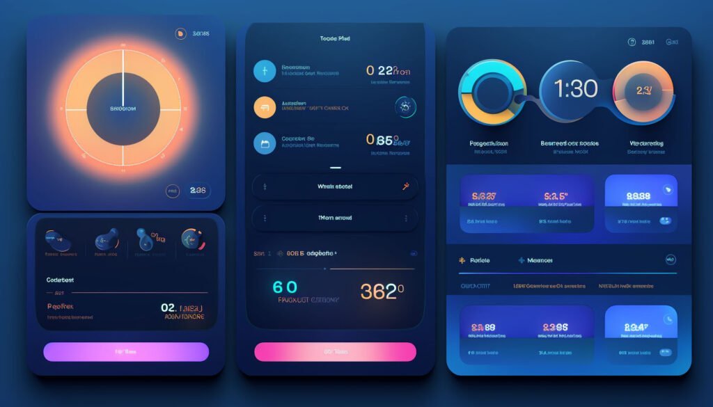
UI/UX that resonates emotionally with users can be the difference between users clicking off your site and leaving a lasting impression. Here are some things you can do to ensure that your design resonates:
Uncovering Emotional Goals
Understanding the goals for your website is crucial. Here are some key questions you might want to ask yourself:
- What is the purpose of your website? Clarify not just the surface-level function but the deeper narrative you wish to convey. Is it to sell products, share information, or foster a sense of community?
- What is your target audience? Go beyond demographics. Understand their aspirations, preferences, and emotional triggers (more on emotional triggers later).
- What emotions do you want users to associate with your brand or website? Consider the emotional journey you want to take your users on. Is it about joy, empowerment, nostalgia, or trust?
Let’s go through the process together using an example. Say that your website is for a business that sells art supplies. The answers to those questions might be:
- The purpose of the site will be selling art supplies.
- The target audience might be aspiring artists in their early twenties.
- The emotions you want your users to associate with might be a sense of wonder and creativity.
Translating Emotion into Design Elements
If the purpose of your site is selling art supplies, then maybe a way to invoke emotions here would be to show your products in action. Showcase art pieces that were made with the products that the website sells.
If your target audience is aspiring artists in their early twenties, then maybe you can think about art trends that are popular with artists in this age group. For example showcasing tufting supplies to make your own rugs which have gotten very popular on TikTok in 2023.
If the emotions you want your users to associate with are a sense of wonder and creativity, then maybe you can make sure that the color palette and the graphic design is modern and fun. Choose vibrant colors and follow the latest UI trends.
Balancing Emotional Impact with Usability
While emotional design is pivotal, it shouldn’t compromise functionality. The challenge lies in harmonizing emotional impact with usability. Therefore, it’s essential to ensure:
- Consistency: How can emotional elements align with the site’s functionality to maintain a seamless user experience?
- Clarity: Will the emotional design elements enhance or detract from the clarity of navigation and usability?
Psychological Triggers
There are various well-studied psychological triggers that you can make use of. Here are a list of interesting ones to consider:
Serial Position Effect: Users tend to remember the beginning and the ends better than the middle, so you should place important elements and calls to actions accordingly.
Gamification: Gamification is the incorporation of game-like elements and mechanics into UI / UX, and there’s a good reason why it became such a popular topic in the past few years.
One of the most prominent psychological triggers used in Gamification is a sense of achievement. Let’s say that you have a website that students use to take exams on – adding a sharing option for tests where they scored high will be a good example of using the Achievement psychological trigger.
The Zeigarnik Effect: This psychological effect suggests that incomplete tasks create a mental tension, prompting individuals to retain them in their memory until they are resolved or completed.
What does that mean for UI / UX? Well, an example of putting this psychological trigger to work would be reminding a user about an incomplete form, putting a progress bar on it or splitting it into stages so that the users don’t get overwhelmed. Don’t forget to give them a sense of closure when they’re finished too.
Gestalt: Gestalt principles explain how our brains naturally organize visual information. I detailed them down below:
- Proximity: Items placed close together are perceived as related. Grouping related elements close to each other helps users understand their connection and function.
- Similarity: Similar elements are perceived as belonging together. Consistent use of colors, shapes, or styles helps users quickly identify patterns and understand their purpose.
- Closure: The mind tends to perceive incomplete shapes as complete. Using minimalistic or abstract icons can leverage this principle, allowing users to infer meaning even from partially displayed or implied shapes.
- Continuity: Elements arranged in a continuous line or pattern are perceived as related. Applying this principle in UI/UX helps create smooth and intuitive navigation, especially in menus, by guiding users along a clear path or flow.
- Figure-Ground: Users naturally differentiate between the main elements (figure) and the background. Emphasizing the primary content or call-to-action buttons against a less prominent background aids users in focusing on critical elements.
Scarcity Effect: People assign higher value to items or opportunities that are perceived as scarce or limited in availability. In fact, studies show that scarcity can boost sales by up to 226%.
Jacob’s Law: This one is sometimes overlooked in the name of innovation, but it’s crucial in creating intuitive websites. Jacob’s Law states that users prefer your site to work the same as other sites they already know.
For example, a logo in a header should lead to the homepage, and links to an accessibility policy or a Privacy policy should appear in the footer.
Conclusion
By asking the right questions, utilizing psychological triggers, and infusing designs with empathy and intent, you can craft interfaces that leave a lasting emotional imprint.


